how might we encourage app users to make reading a part of their lifestyle in order to learn and stay connected to others?
Involvement
User interviews
Affinity maps
Persona creation
Problem definition
User flows
Feature prioritization
Paper and digital prototypes
Usability tests
Challenges
Saturated market: Books have taken many forms since its invention centuries ago. Differentiating my product will require good research.
Time limitations: This project was constrained to six days from start to finish.
OUTCOMES
Learnt UX methodologies: This project allowed me to learn the nuances of user experience in digital contexts.
Practice Figma: Being fluent with the Adobe Creative Suite, I challenged myself to get familiar with a new software.
PROBLEM
“Read more” is a common new year’s resolution. But how is “more” defined? What titles does one read? Does the medium matter? One means of effective goal keeping is accountability. How would a social experience of reading affect motivation to read? Would other persons be required or is an app enough? Are book clubs too old-school?
Without planning and tracking, good intentions remain simply as intentions. Perhaps at best, the goal is met half-heartedly.
RESEARCH
To guide and standardize my user interviews, I created a discussion guide including questions like:
What motivates you to read for personal enrichment?
Tell me about your last book club experience. [If not applicable: Tell me about your impression of a book club.]
Why did you join that book club? [If not applicable: What would compiles (or restrains) you from joining a book club?]
User interviews and affinity mapping revealed:
Reading is both personal and relational. People use it for personal enrichment, as much as relational fodder for conversation and bonding.
Reading consistently as an adult is tough because of competing priorities.
Several people reported negative book club experiences that they associated with “pressurized reading”, “homework”, “socializing without actually discussing the book”.
Print readers are more likely to convert to a digital experience if it’s an enhanced (feature rich) version of the physical experience.
These insights led to two primary personas –– the Social Reader and the Busy Learner.


Through a competitive analysis of other apps, I learnt:
Audiobook/ebook apps allow you to purchase but don’t help you actually read the books.
Book club apps help you schedule gatherings but don’t allow you to purchase book.


DESIGN
With these insights, I sketched a user flow and some wireframes. Through feature prioritization, I ended up with the following features for my minimum viable product.
Set measurable and time bound reading goals
View, comment, and post to network/feed
Buy audiobooks
Listen to audiobooks
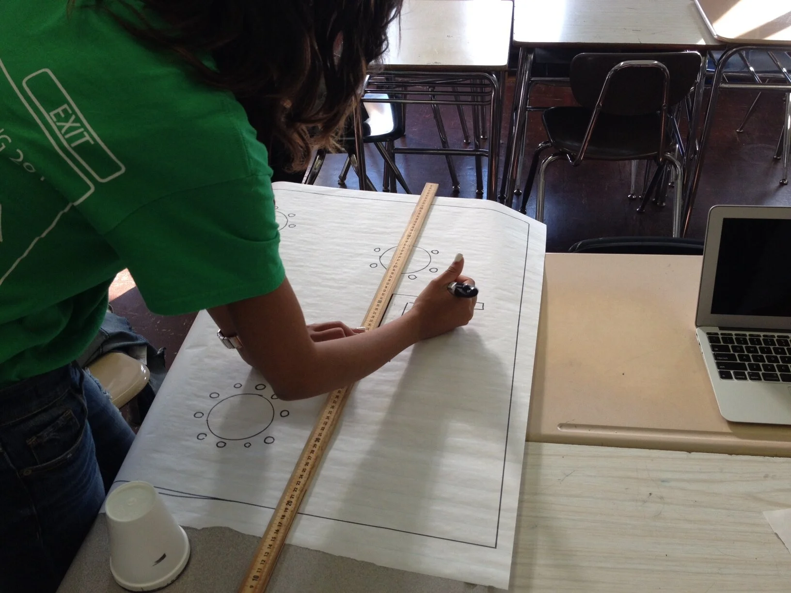
After creating a simple branding system, I digitized my concepts. With my initial prototypes, I conducted usability tests. These tests revealed that while my brand tone was on target, my user interface was not as intuitive as I thought.
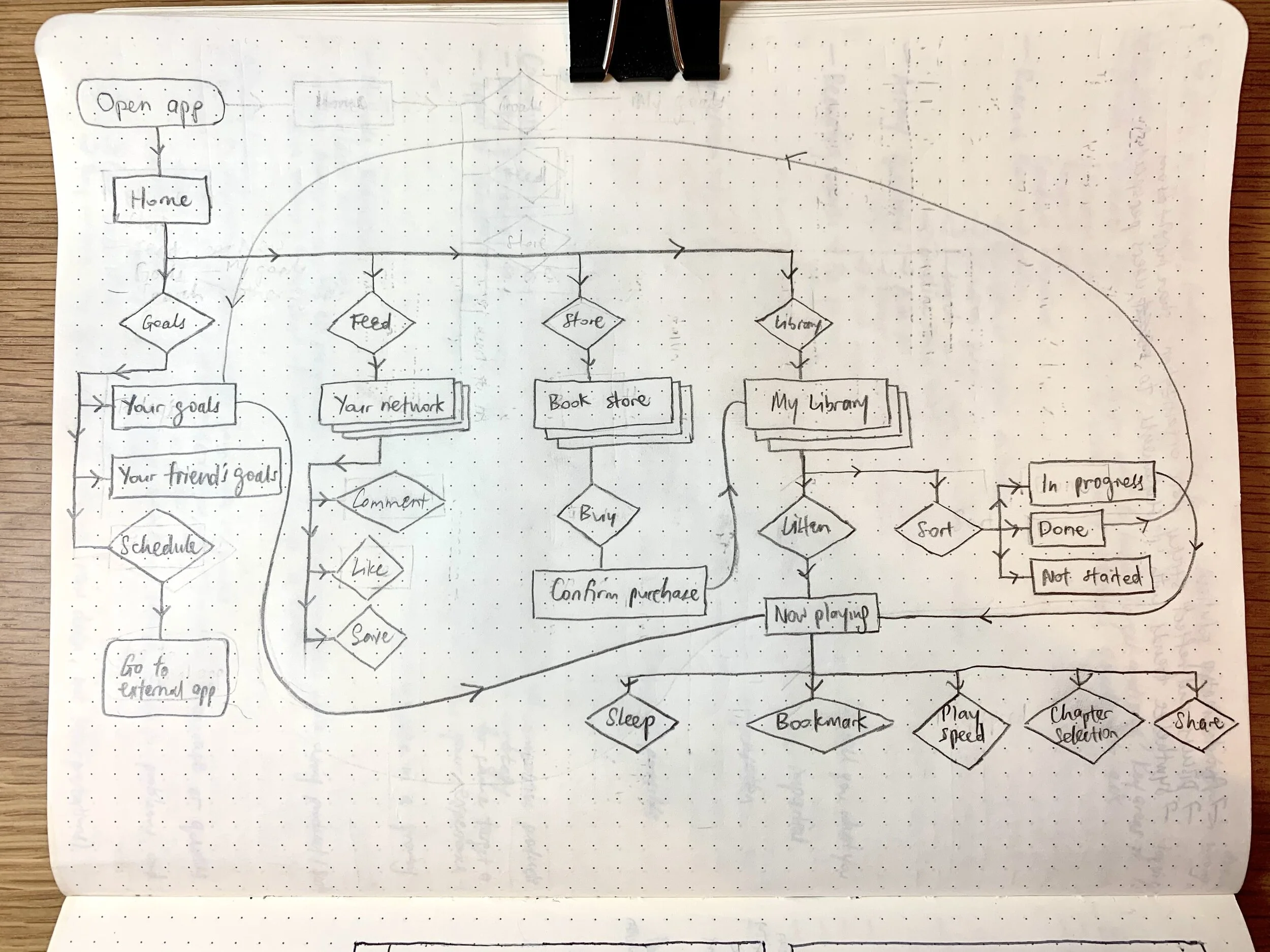
Initial app user flow

App wireframes

Initial digital concepts
Next Steps
Six days is not enough to take on a technology (printed books) that’s been around for centuries and evolved a lot since its invention.
Booked is not really about books per se, but about the way busy adults continue to learn outside of a structured environment. Bringing this app to market will require more research and insight into broader adult learning trends and potential brand partnerships.
how might we showcase the analysis grant officers put into the recommendation process so that board members can make more effective decisions during a shortened digital board meeting?
Involvement
Problem definition
Research process development
Digital prototypes
Usability tests
Challenges
Board members were not part of this process: Even though the results of this project could affect their decision-making, they were unable to directly contribute their insights.
Balance quality with quantity: The grant review process has many nuances and complexities. The recommendations needs to be robust yet succinct.
Outcomes
Refreshed format accepted by board members: The new format was warmly accepted, save for some tweaks. The new design brought grant officers and board members onto the same page, leading to more informed decision making.
Increased desire to formalize our process: Seeing the success of the grant scorecard, the board proposed developing such tools for other processes within the organization.
context
When our organization went remote due to the COVID-19 pandemic, we had to adjust our board meetings accordingly.
We halved the length of these meetings to better suit the virtual communication. Yet, grant officers were required to present the same amount of work. Board members still needed to make grant decisions with the recommendations presented by grant officers.
Suddenly, the grant recommendation had to work harder than it did before.


Process
After being asked to tackle a redesigned grant recommendation form, I spent time listening in detail to the felt needs of a senior grant officer. We realized we weren’t on the same page with our definitions, and needed to better understand how the current one looks how it does today.
Through video call, we went through each iteration of the recommendation form. Since the senior grant officer had created some of these iterations, we were able to talk through the decision making process and how the board members responded to them. This acted as a proxy for the absence of the board members feedback.
We realized grant officers employed a scorecard of six measures in each of their grant assessments, yet this was not visually reflected in the final recommendation.
Because the scoring process was opaque, board members often disagreed with the final organization scores at board meetings. This led to process inefficiencies and miscommunication.
With this key insight, I included the grant scorecard in my initial drafts of the updated recommendation form. Other grant officers expressed concern about the increased scrutiny “showing our homework” might bring. This led to rich discussions about our grant process and communication with the board.
Including the grant scorecard in the updated recommendation form brought board members greater clarity, leading to a request to further develop other such matrices for the grant process.
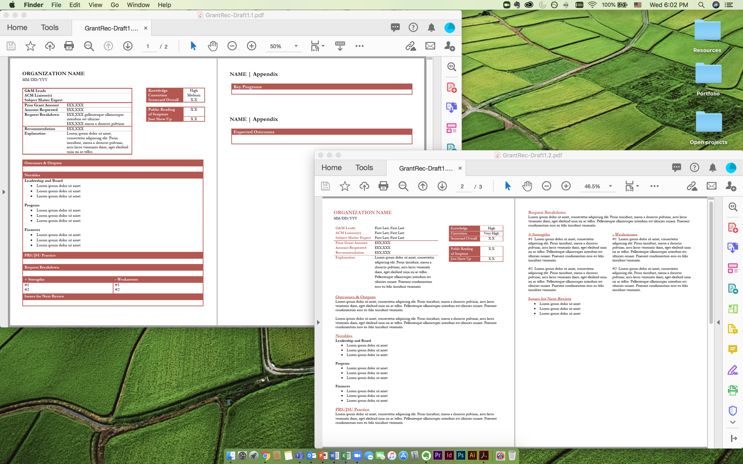
Deliverable

Cover photo by Kelly Sikkema on Unsplash

How might we ensure all stakeholders understand the grant process well enough so that the process is smooth for all involved?
Involvement
Co-create journey map
User interviews
Affinity maps
Paper and digital prototypes
Challenges
Opaque process: Multiple stakeholders act independently while assuming others also have intimate knowledge of how each part is completed.
Low value of design research: The senior leadership at the organization did not buy-in into the need for such a project.
Time limitations: This self-initiated project was conducted while managing other projects.
Outcomes
Greater transparency: Having each stakeholder who participated gained a more accurate understanding of the process from micro and macro perspectives.
Increased value of design research: Participants walked away from research sessions feeling heard and expressed desire for such methods to be used for other projects.
context
A colleague and I initiated this project when our organization was deciding to switch online grant portals. The previous portal was frustrating for all parties—grant officers, grantees, and administrators—to navigate and use, and our senior leadership was keen on trying a new product.
What we noticed however, that the decision on a new portal was made hastily and without much research. This meant an increased likelihood of repeating the same mistakes and wasting valuable resources.


Process
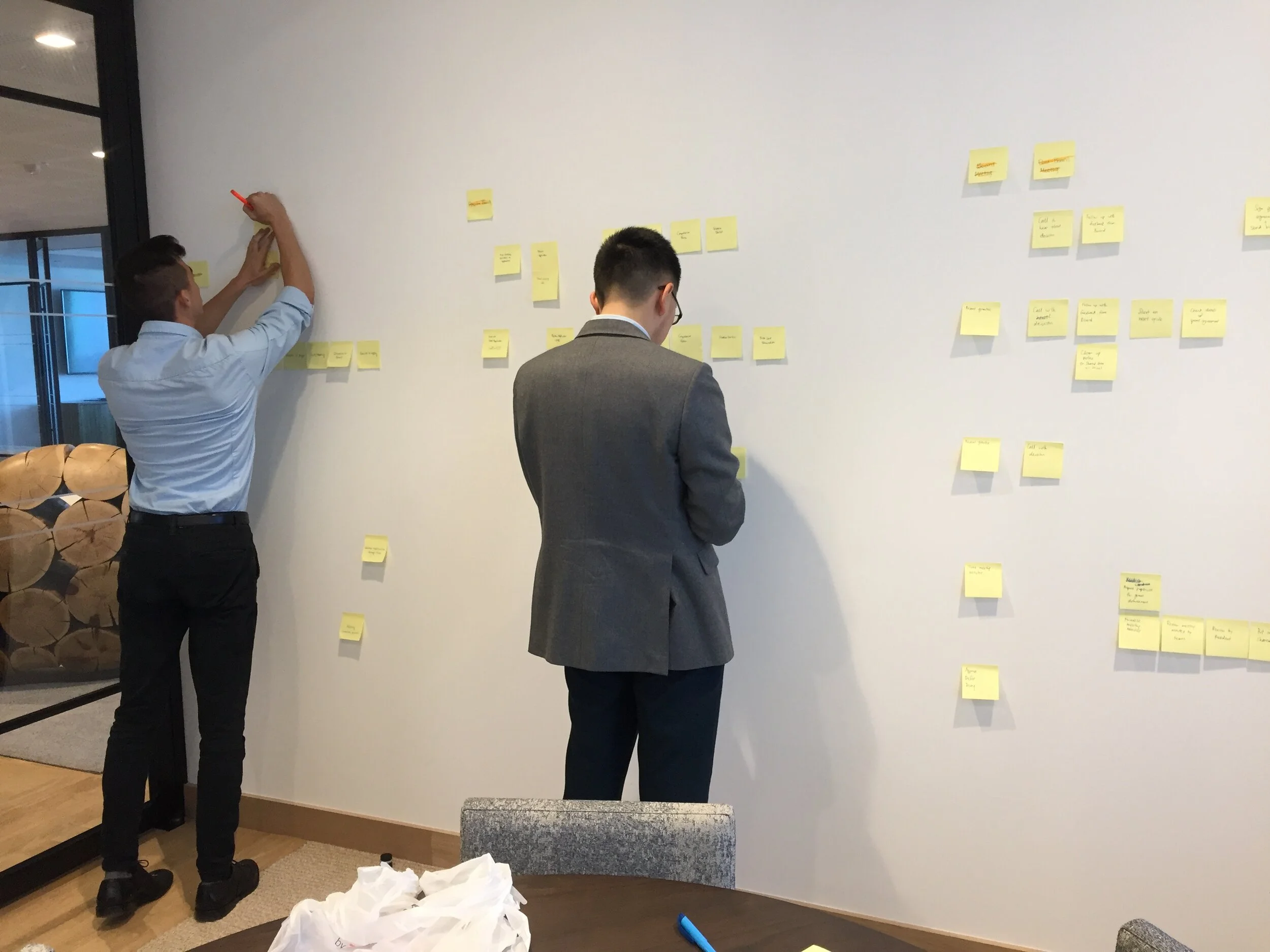
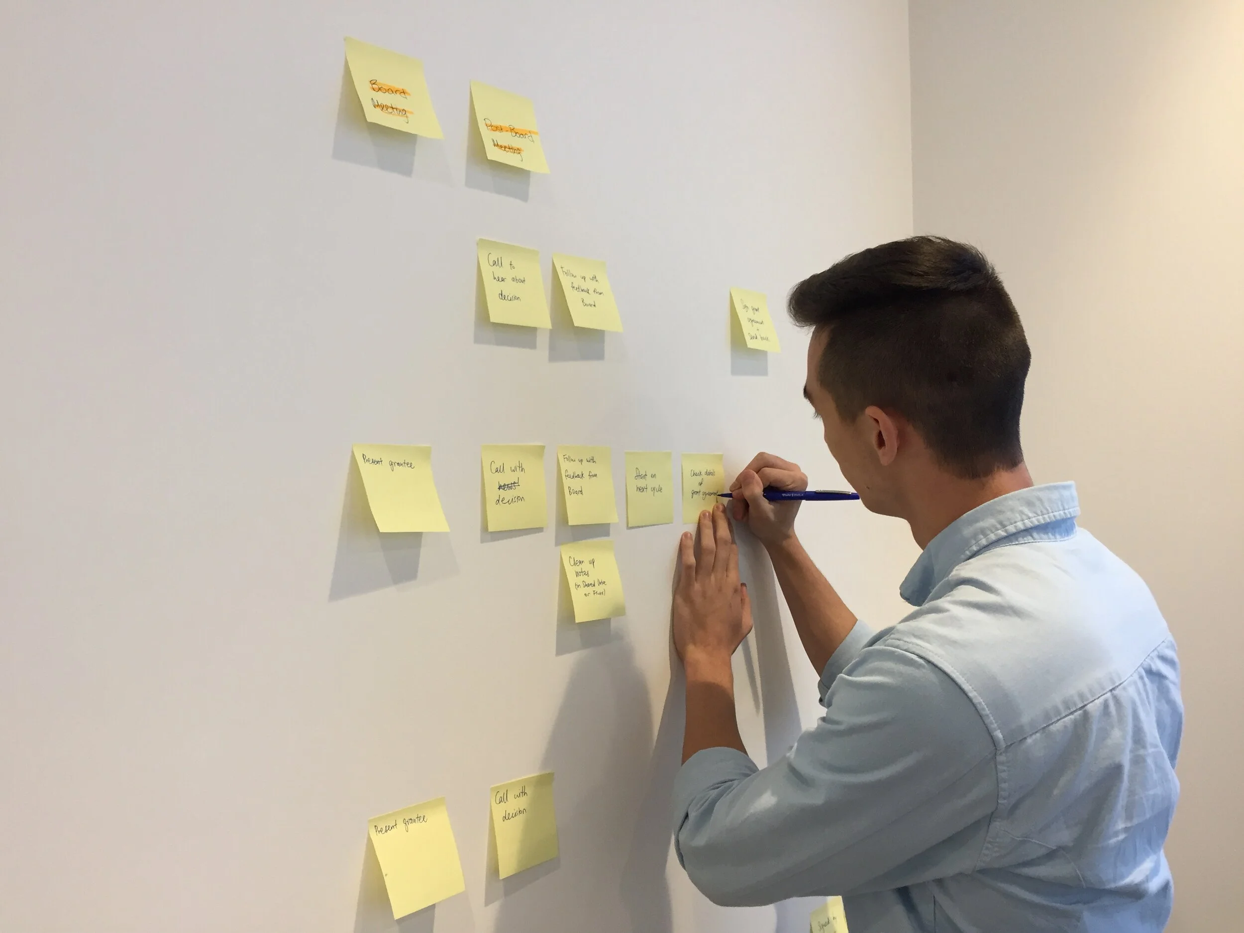
Since I was the one most familiar with user research on our team, I worked with our summer intern to lay out a simple user journey map listing all stakeholders, processes, and tools. I gave him some sample journey maps for reference and explained how we might create a tool to invite each stakeholder to offer their insights. We went with a low fidelity prototype (hand-drawn and photocopied) to achieve this goal.
With our first prototype in hand, we set up individual time slots to hear from grant officers and administers. We offered gummy bears to help interviewees mentally transition into a more relaxed mood. We asked each person to share their perspective of the grant process by marking up the chart. We documented any comments and insights that came up with a sticky note.
Once we talked to all our interviewees, we laid out all their maps together and our team of three synthesized the parts to form a final map representing the variety of perspectives on the grant process. I then digitalized the map.
Through this project, the new grant portal was developed to include permissions for relevant stakeholders (like administration and finance), rather than just the grant officers. This increased process efficiency and communication.
how might we get to know others who are not like us so that we can make a meaningful thing together (while learning experience/service design methodologies)?
Involvement
Research discovery
Research synthesis
Affinity maps
Workshop and toolkit design
Workshop facilitation
Paper, role play, and spatial prototypes
Challenges
Open-ended brief: Throughout the process, we designed tools to elicit unconscious desires and responded flexibly to changing needs and circumstances.
Genuinely working with people with varied life experiences: Throughout the process, each participant had to face their bias in access to resources, structural racism, and America’s criminal legal system.
Outcomes
Tailored cafe spaces for each learning community: WHEELS and Fortune set up spaces on their campuses giving faculty, staff, and students a convenient, low-cost environment, where they can relax and reconnect.
New ways of working with others: Each participant learnt the value of working with, not against, a diversity of individual experiences in order to gain a more equitable whole.
context
This two-year project was a partnership between three learning communities: university students at The New School (TNS), public high school students at Washington Heights Expeditionary Learning School (WHEELS), formerly incarcerated young people at The Fortune Society (Fortune), and teachers from each.
Drawing inspiration from Kay Ryan’s “We’re Building the Ship as We Sail It”, the project's objective was to engage these grounding questions:
What does it mean to make a thing for ourselves?
How do we tell our own stories?
How do we use this process to create new, and strengthen existing, communities?
Rather than privileging one voice over another, the group collectively determined what we would make as we got to know each other. This project emerged from each person’s prior experiences in working together, and a shared interest in creating something meaningful for participants’ lives where that meaning wasn’t externally imposed.
We designed more reactively than proactively. We teased out and dealt with our preconceived notions.
Differences of privilege, access to resources, and experiences with structures like racism, poverty, education, and the criminal legal system were project cornerstones.
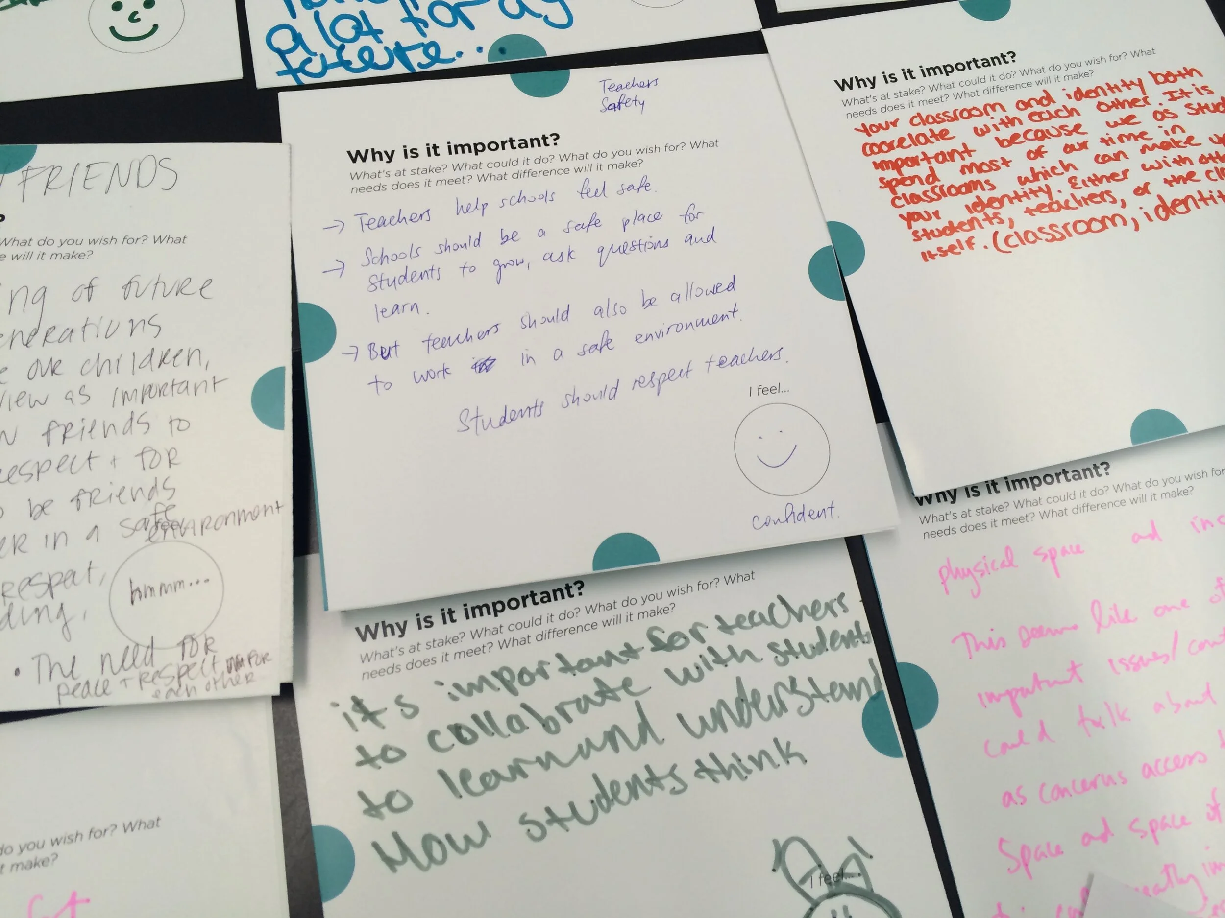
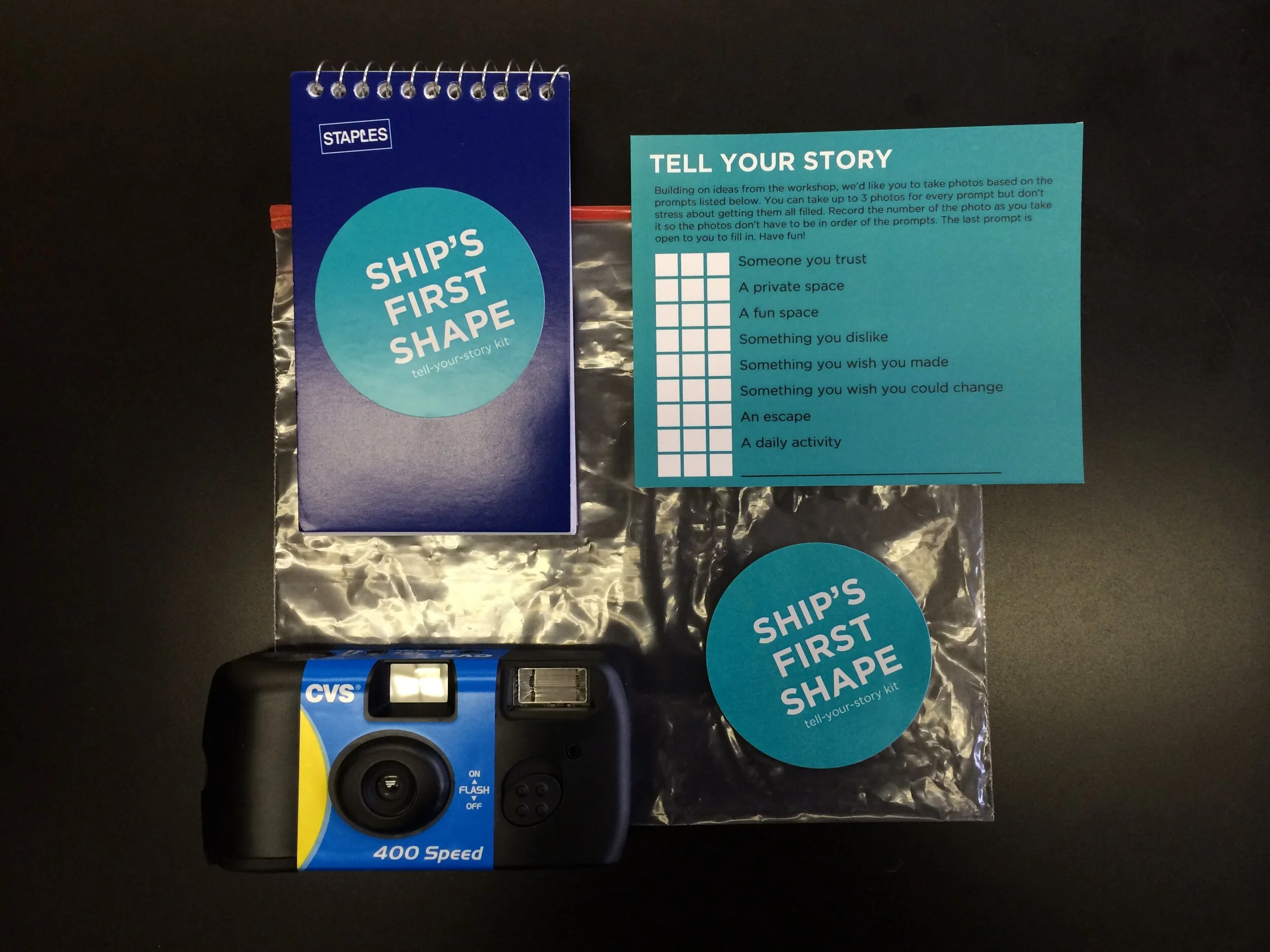
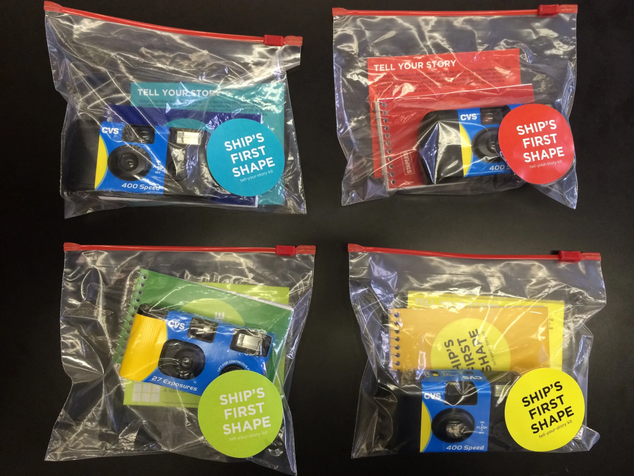
4W Workshop & Tell-Your-Story kit
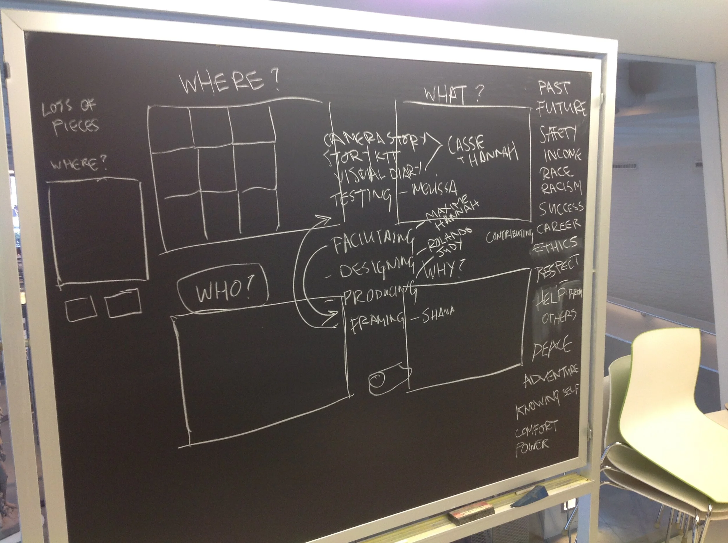
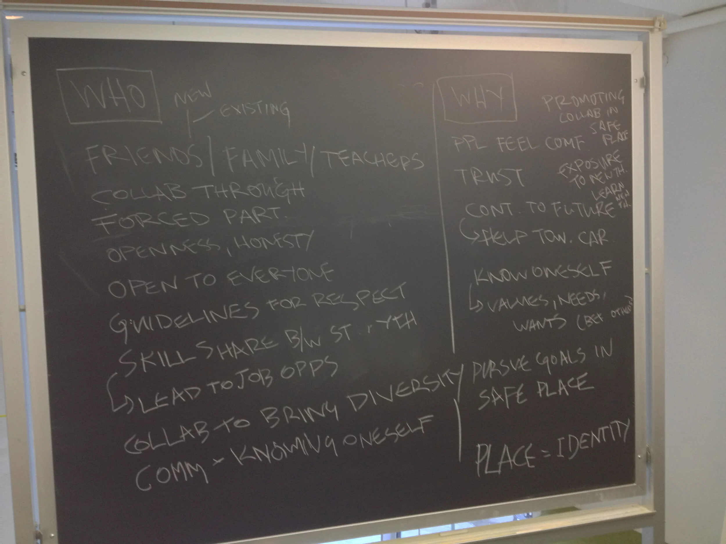
The second phase of this project sought to surface underlying desires and needs with an as-yet undetermined end goal. In response, the TNS students created an open-ended framework for discussion based on 5W1H. Knowing we would have to make a thing by the third semester, we left out “When”. The “How” was what we wanted to determine together.
After the workshop, the TNS students left a disposable camera toolkit for the WHEELS students to share glimpses of their lives through their perspectives, following prompts on a note card.


Cafe prototypes
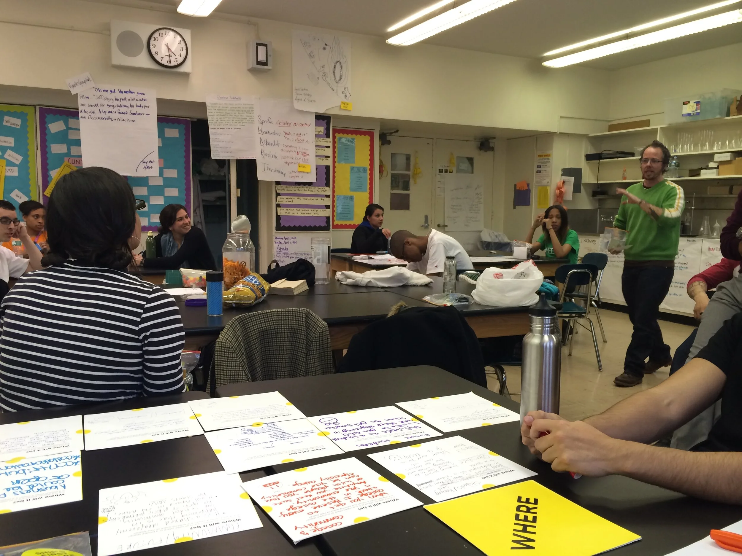
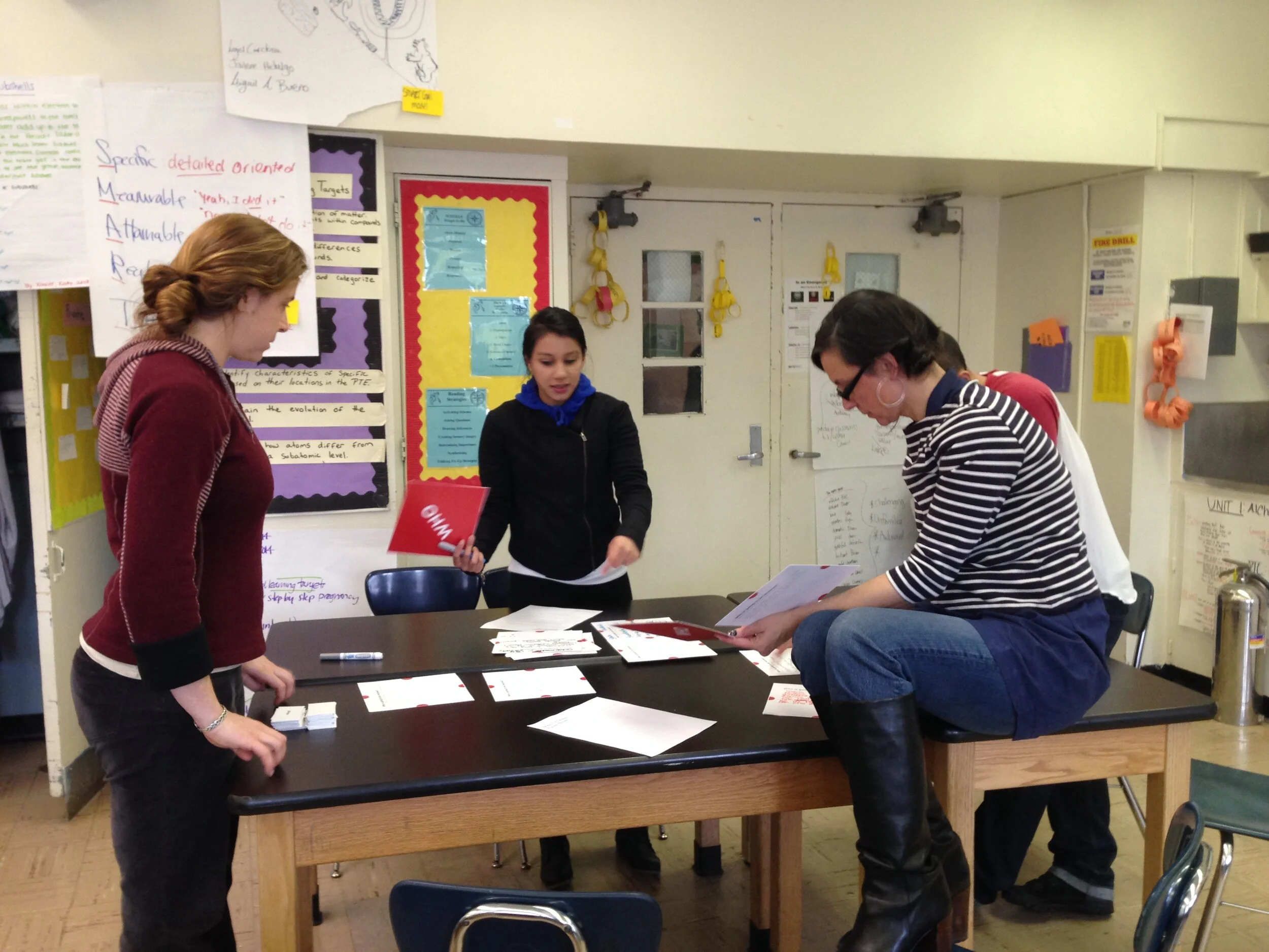
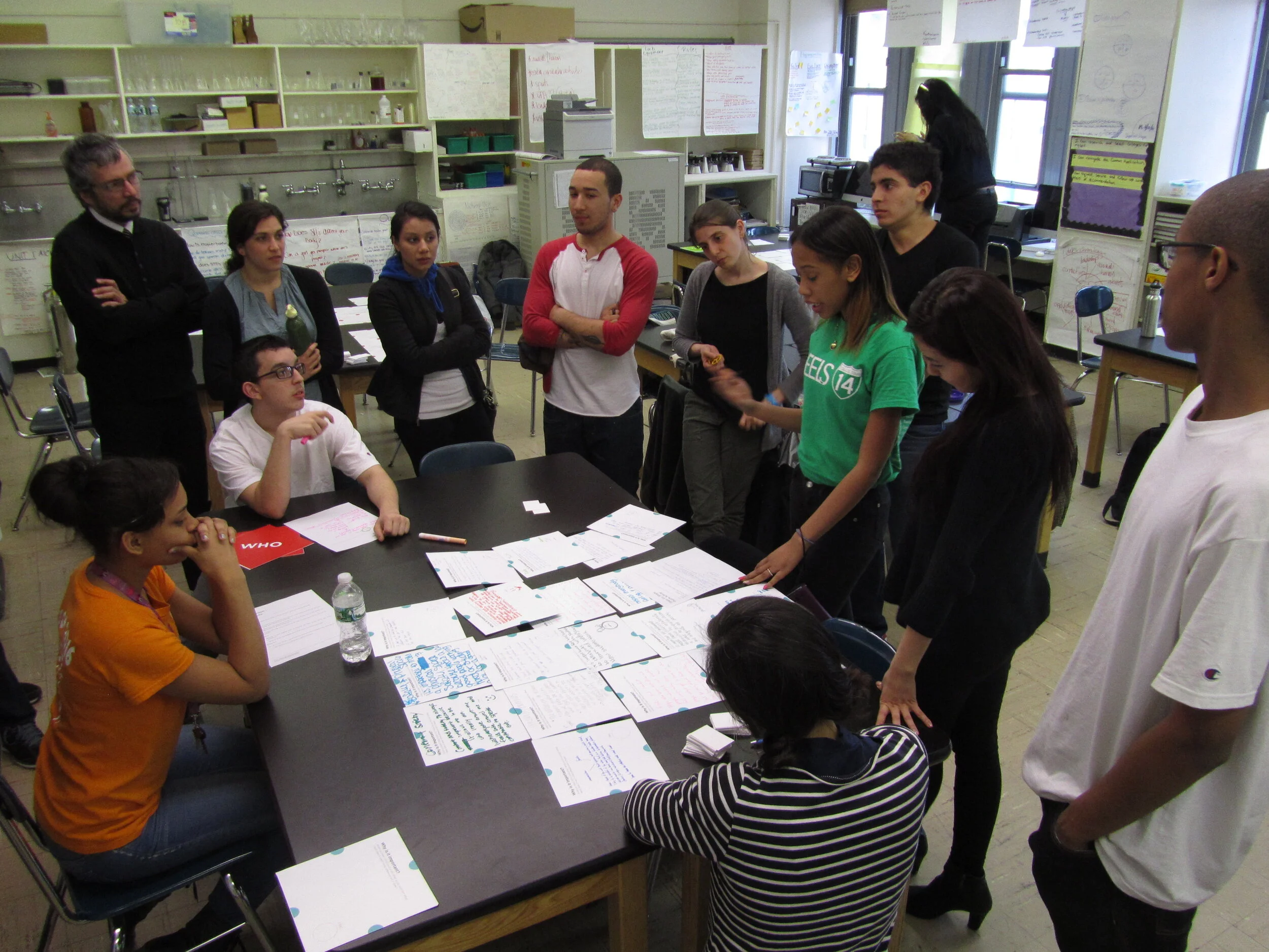
Late in the third phase of this project, we collectively decided cafes within the WHEELS and Fortune campuses was the way forward. We began with putting our ideas on paper. We sketched, wrote, and talked about everything from location to food to programs.
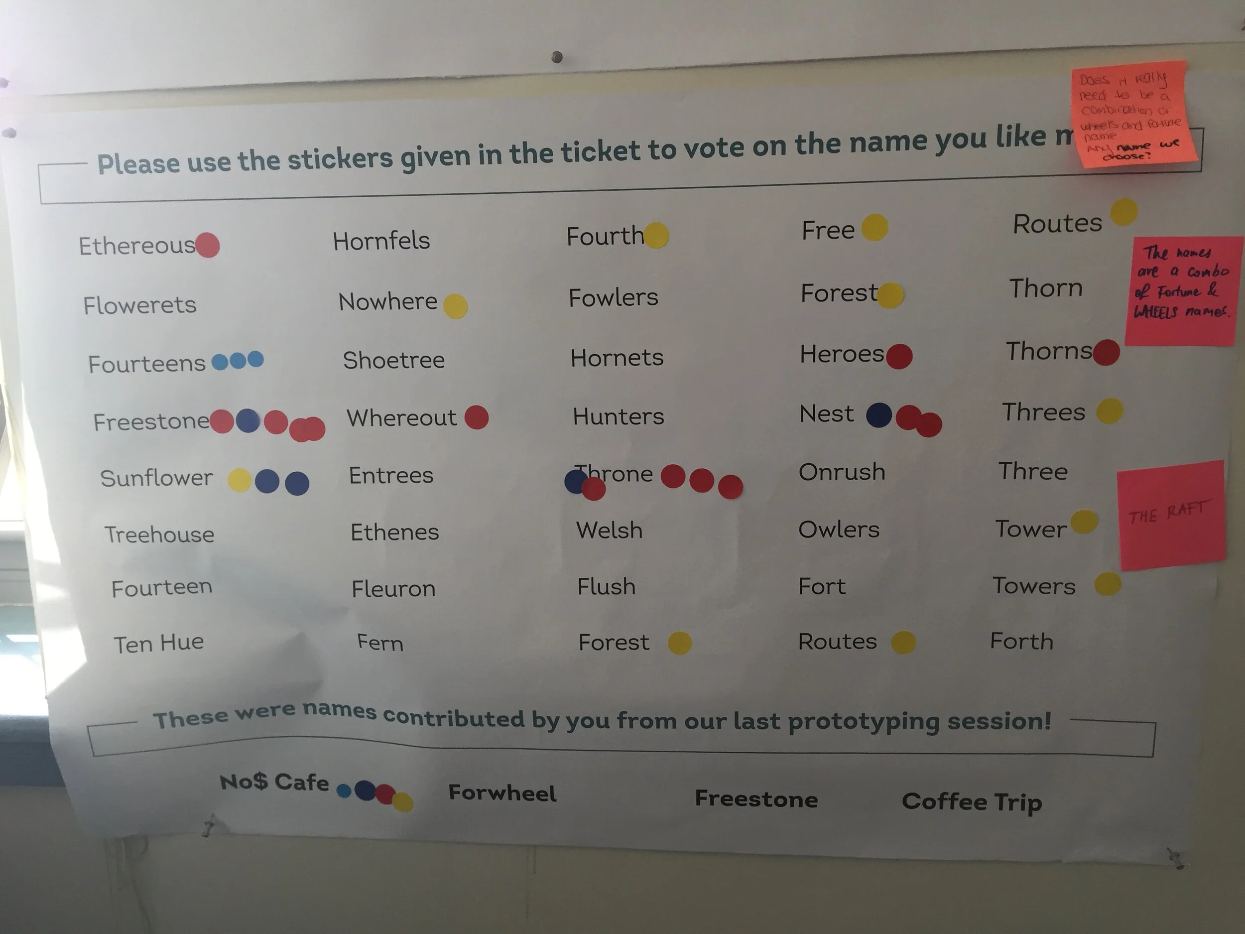
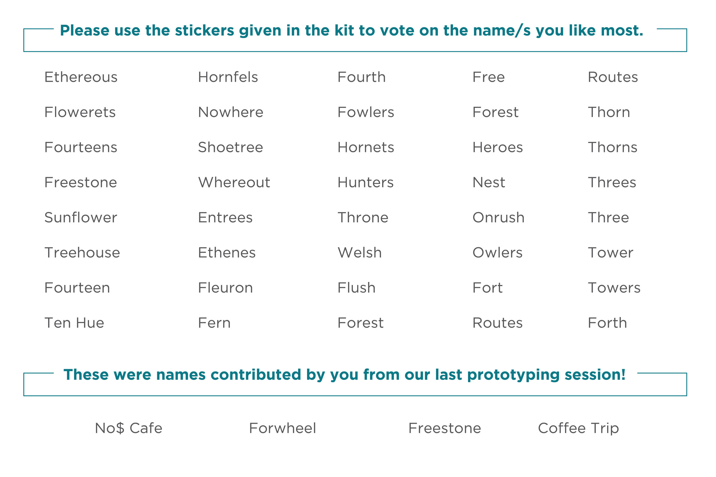
Since we were desired for these cafes to be a welcoming place for the wider communities at WHEELS and Fortune, the TNS students proposed a voting and comment system where prototype participants could contribute their opinions. In order to privilege voices from the communities where the prototypes were being held, we used a color code to differentiate the schools. This system also allowed us to test furniture aesthetics without committing to a specific look until we heard from the community.


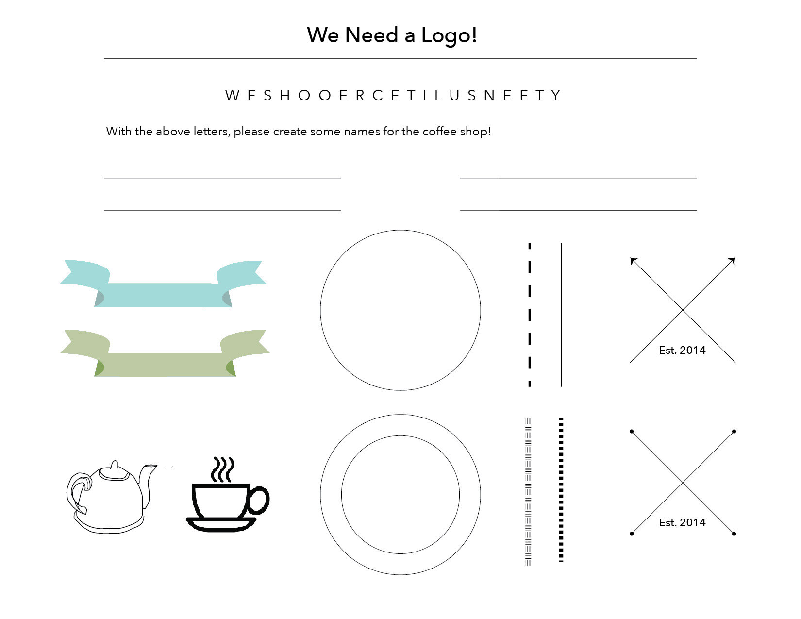
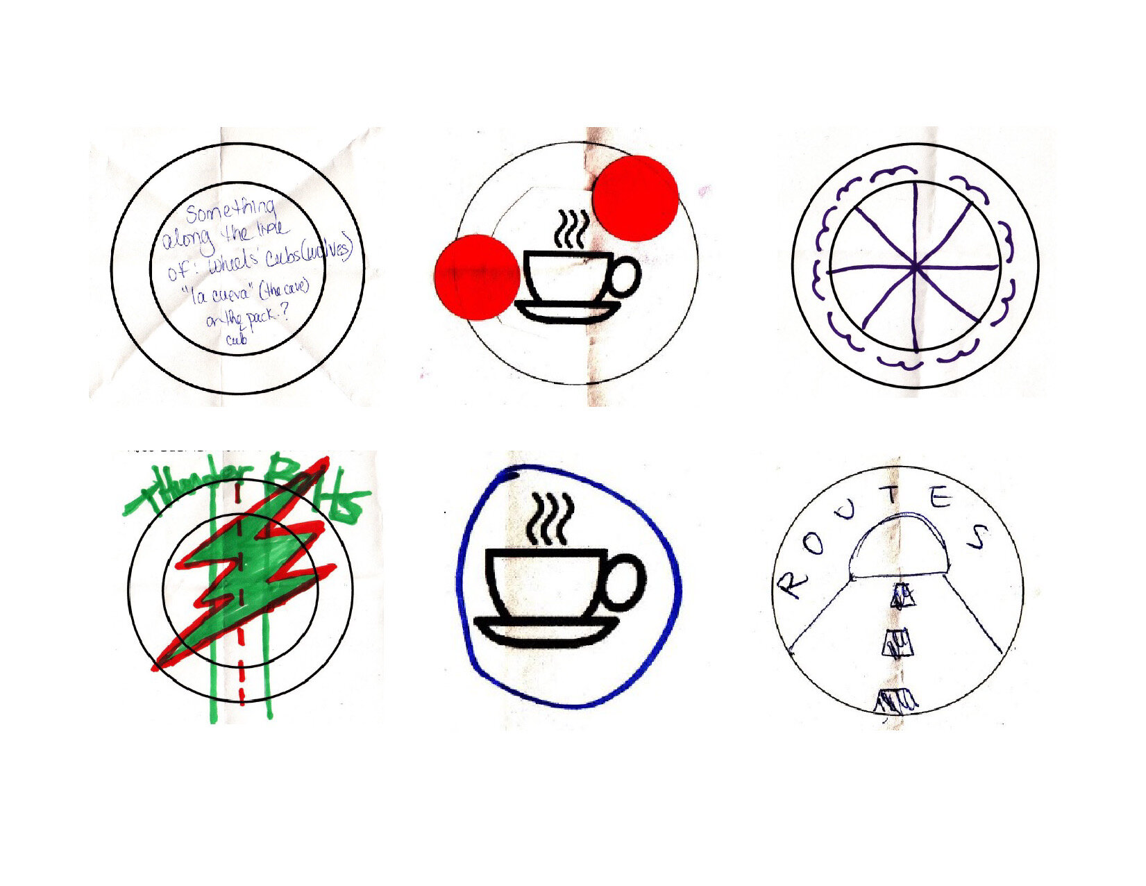
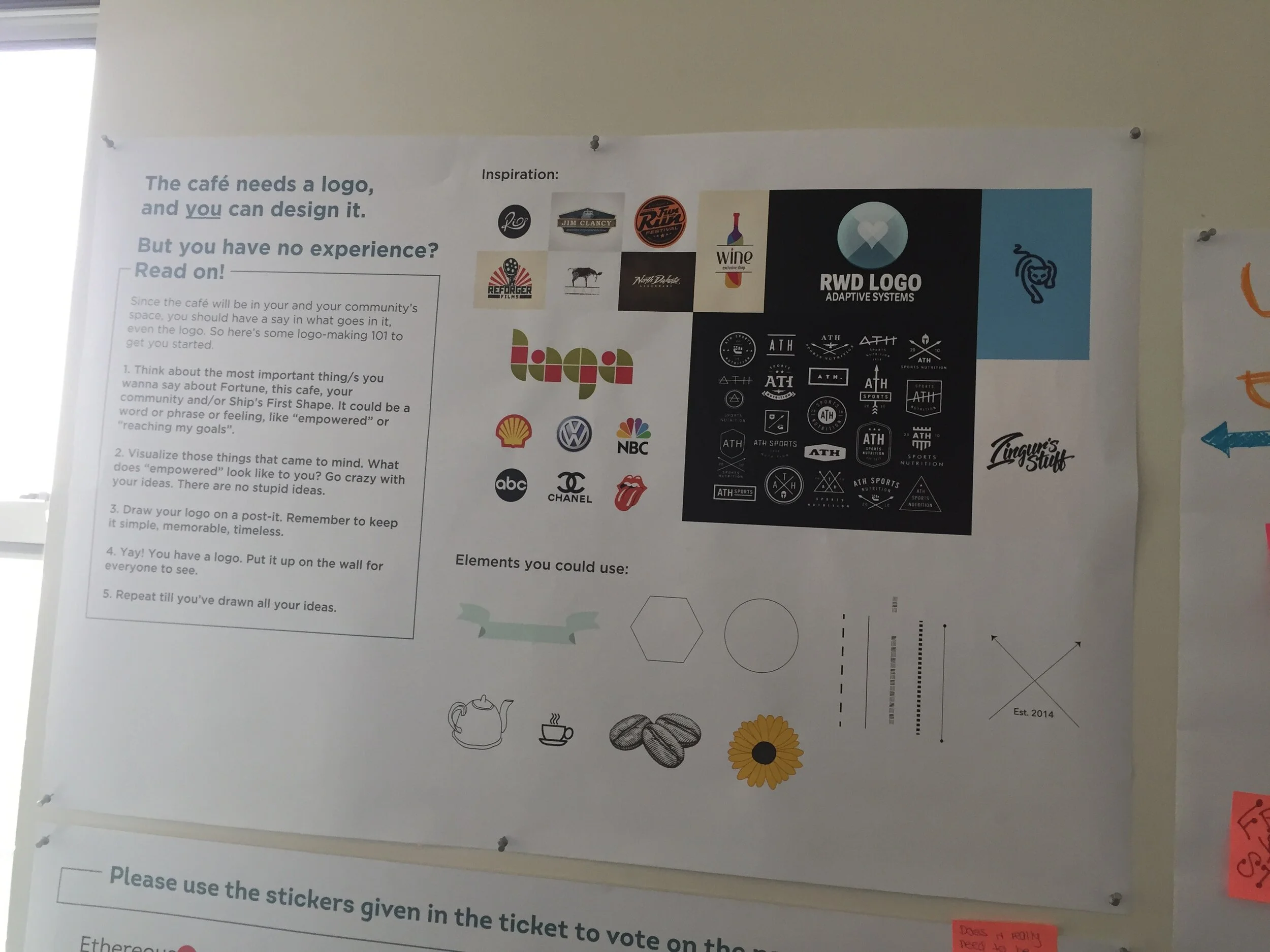
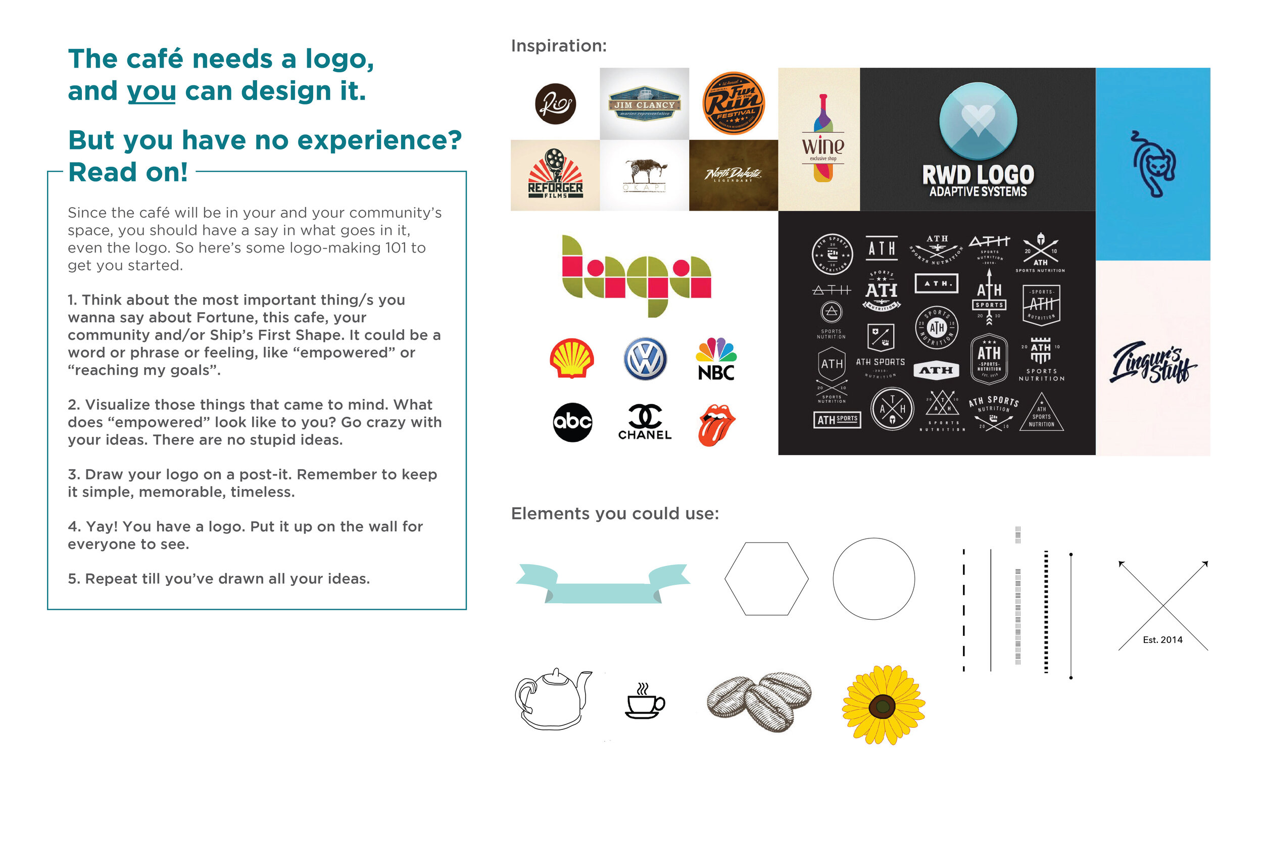
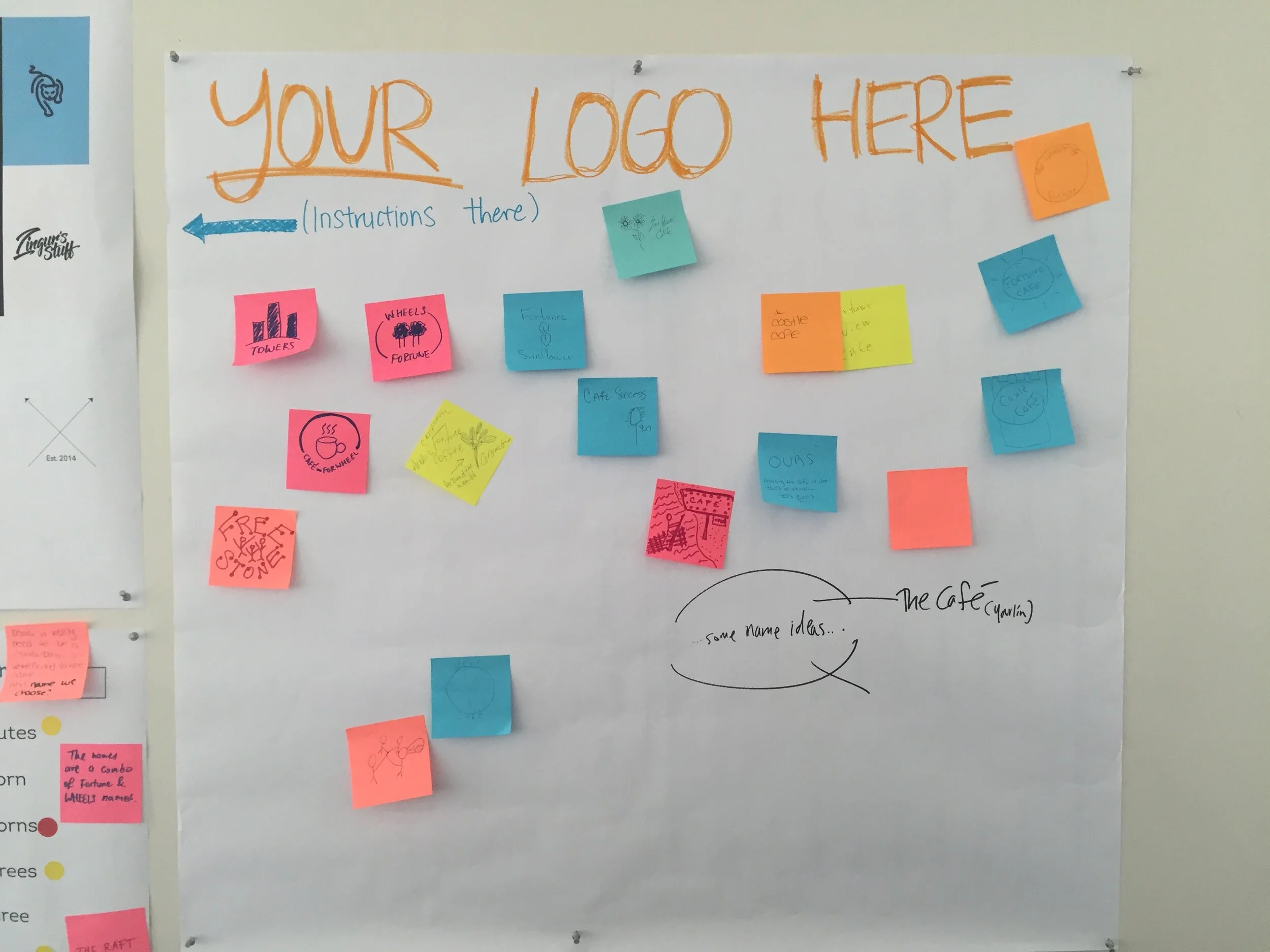
Logo Collaboration
Part of building a cafe was creating a logo. In response, the TNS team created worksheets and posters so a logo could be collaboratively designed by the collective, as well as others in their communities.
These sheets were placed on site at the experience prototypes at WHEELS and Fortune. These sessions were held in the third and fourth phases of the project. At these sessions, participants could contribute ideas by drawing and writing their own, voting for their favorite ideas with sticker dots or commenting with sticky notes.

This project was featured in The New School’s Collaboratory.
how might we design a museum experience for when first-hand witnesses are no longer alive so that the museum can be a living memory?
Involvement
User observation
Research synthesis
Journey map design
Futuring
Storyboard creation
BRIEF
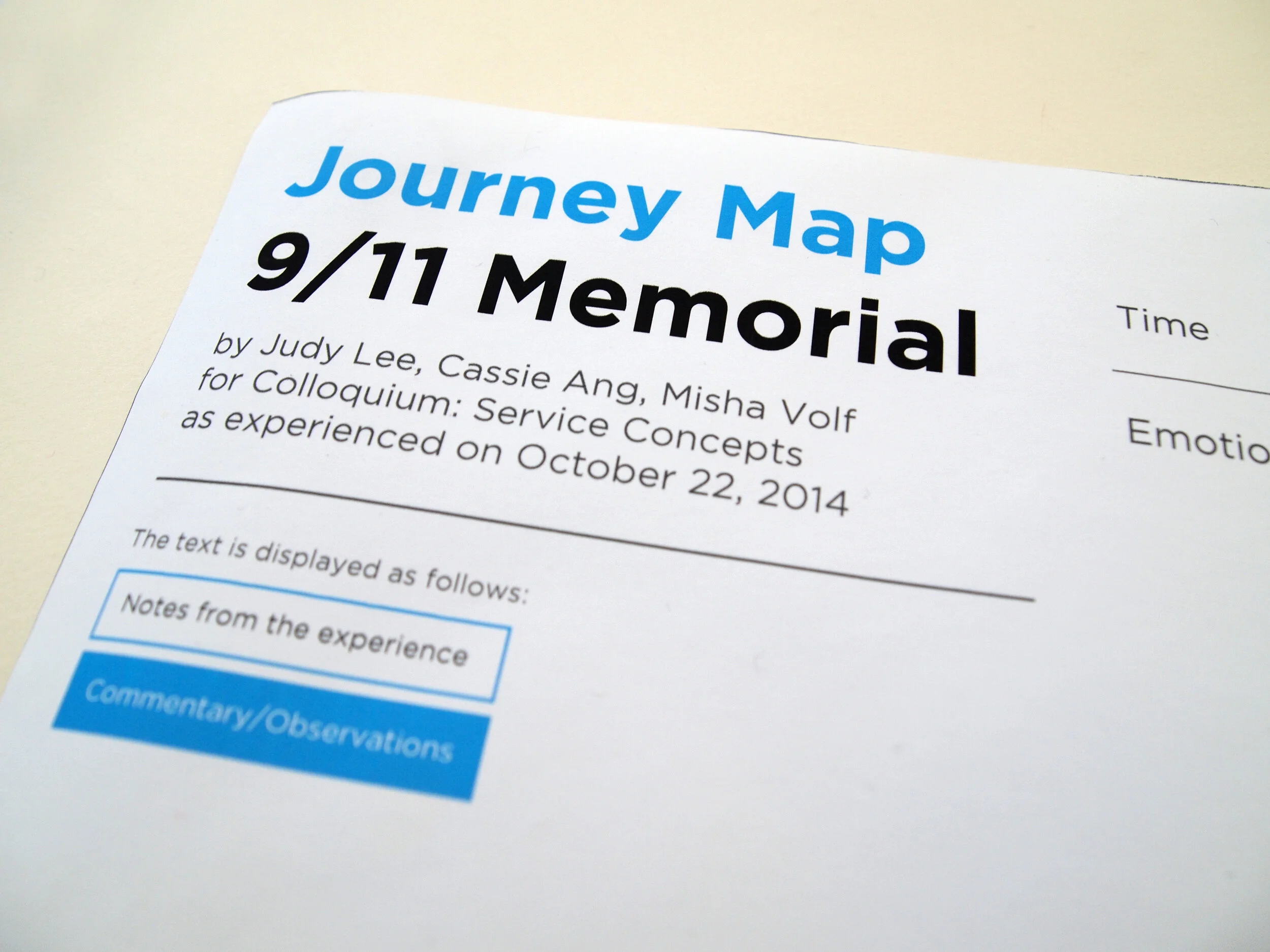
In 2114, all the firsthand witnesses of the events of September 11, 2001 are unlikely to still be alive. If the National 9/11 museum still stands, what would a museum goer’s experience be like? What would the world be like at that time? What would museums look, feel, and sound like in that future? This is an interpretation by Judy Lee, Misha Volf, and me.
Present
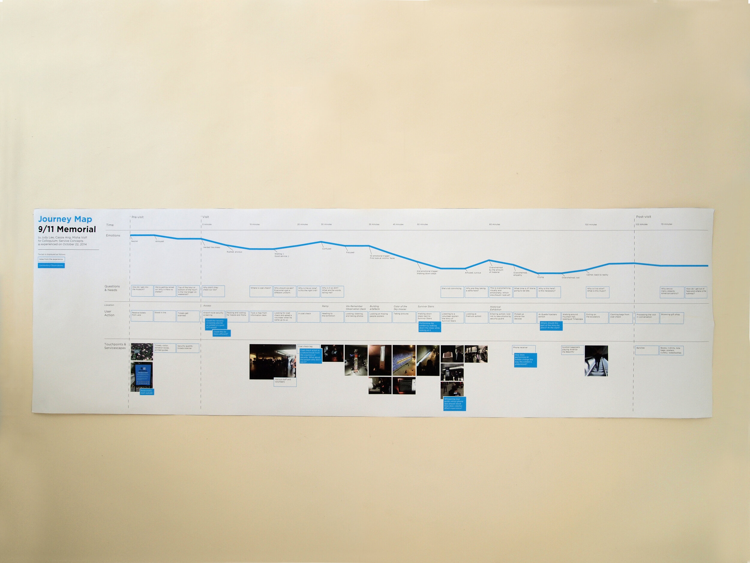
We visited the National 9/11 Memorial together on the same day at the same time. We sought to experience the museum through an AEIOU framework–Activities, Environments, Interactions, Objects, and Users. We looked around, recorded brief notes, and took photos. At the end of our visit, we captured our reflections via audio, focusing on our emotion journey through the museum.
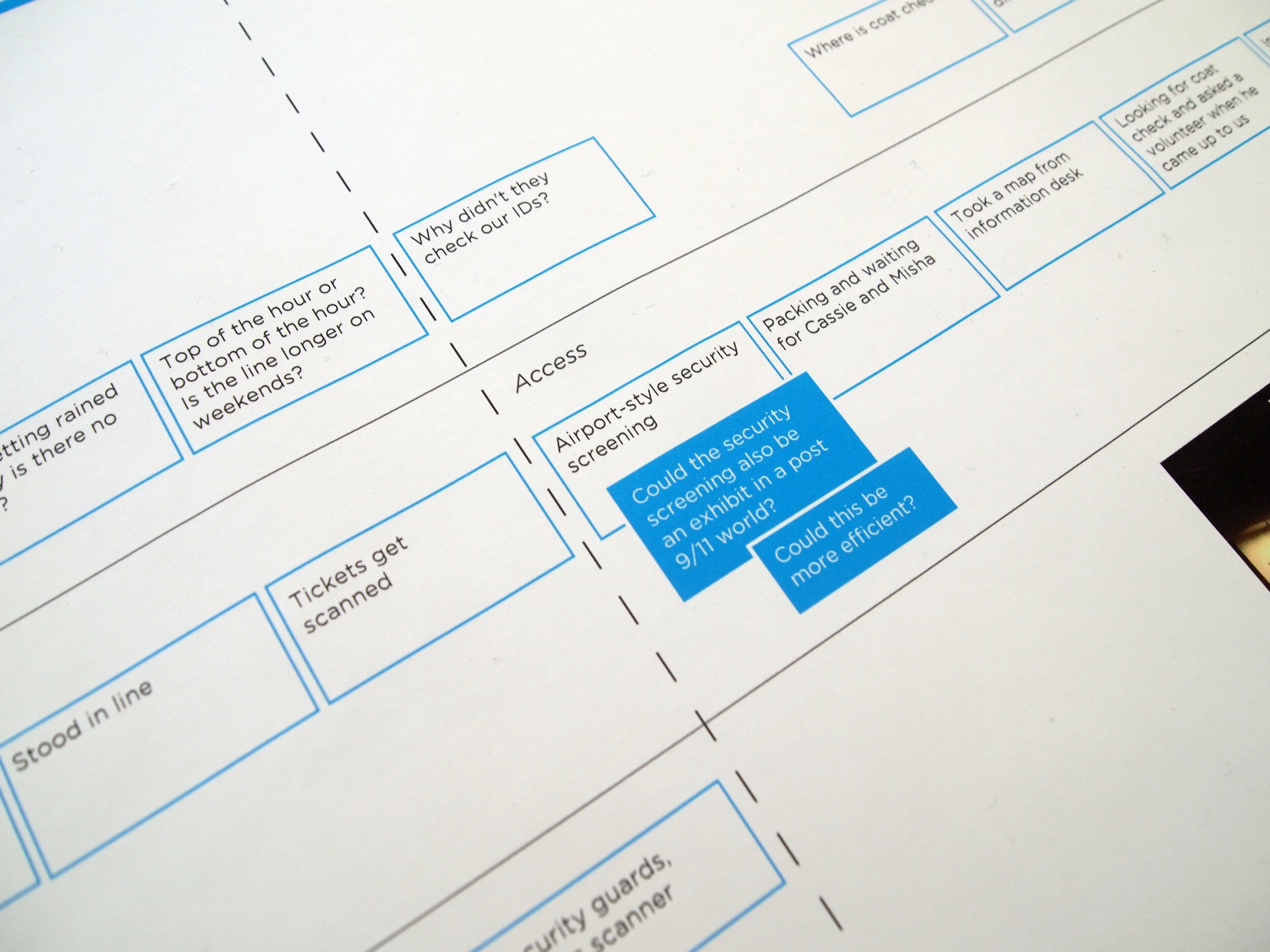

Connecting present to future
We imagined together what the future state of the museum could be like. We brainstormed possible social functions, translated them into user experiences, and sketched what they might look like.

Building the future context and imaging the museum experience within it
Future
The group presented a detailed sequence of our version of the memorial in 2114. I worked primarily on the copywriting and layout of the storyboard, while contributing ideas for the illustrations and video production.